Poll will close on 18 Mar 2025
Poll
Which skill would you like to enhance: Creating or Interpreting data visualizations?
3 Comments
Sign in to participate
I might need an example of the second category. Don't you interpret a visualization just by looking at it?
That's a great question.
Here's an example I just threw together. Someone presents these anual projections in a meeting and suggests that the projected anual growth seems to be slowing down between 2026 and 2028.
- Does the data support this claim?
- Between what two years did the projections double?
- (my favorite question to ask) What data isn't shown?
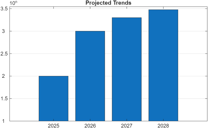
I don't think you'd have trouble answering these questions, but I'm curious about the types of questions and challenges people generally face when reading and inspecting data presented graphically.
There is extensive literature on creating data visualizations and some on detecting manipulations within them. However, there seems to be much less content on data visualization literacy, a skill I believe is more commonly needed than creating data visualizations.
I'm considering a blog article on this topic.
I would opt both...


Select a Web Site
Choose a web site to get translated content where available and see local events and offers. Based on your location, we recommend that you select: United States.
You can also select a web site from the following list
Americas
- América Latina (Español)
- Canada (English)
- United States (English)
Europe
- Belgium (English)
- Denmark (English)
- Deutschland (Deutsch)
- España (Español)
- Finland (English)
- France (Français)
- Ireland (English)
- Italia (Italiano)
- Luxembourg (English)
- Netherlands (English)
- Norway (English)
- Österreich (Deutsch)
- Portugal (English)
- Sweden (English)
- Switzerland
- United Kingdom(English)
Asia Pacific
- Australia (English)
- India (English)
- New Zealand (English)
- 中国
- 日本Japanese (日本語)
- 한국Korean (한국어)