From Acorn to Oak: Seeding Federated Learning with Physical Models
We will walk through the end-to-end workflow, with particular emphasis on the integration of streaming data into the development environment and the benefits to data scientists of a simulated production environment. We show how physical models accelerate bootstrapping the system. We discuss the system in the context of MLOps. We conclude with a summary of the effect of such architectural tradeoffs in an operational system as they informs the system’s evolution
Published: 23 Dec 2020
Thanks for coming to our talk today. I'm Peter Webb. My work at the MathWorks focuses on MATLAB deployment and remote execution. I'm joined today by Lucio Cetto, who knows much more about machine learning and math than I do.
We're here to share a use-case story with you. We used federated machine learning to develop a predictive maintenance application for industrial cooling fans. We trained a model to detect anomalies in sensor data streaming from the fans and trigger service alert. And we were production ready in 30 days.
How do we put a big system like that together so quickly? No big secret. We used a box-- you know, that box everything comes out of. Out of the box, off the shelf-- software we could just get and use. We needed a physically accurate simulator to generate training data, a streaming service to transport sensor data from the fans to an analytics engine, and a metrics visualization platform. And we had to configure the connectors that glue all the pieces together.
But then we could focus on the work that mattered. Lucio had to write the machine learning analytics. And I had to create that metrics dashboard. But before we get to that, a bit about the project itself.
So here is the general idea. Scan the data produced by fans from a factory to generate service alerts. But we've got more than just one factory. And each of them has knowledge that the others don't.
If we combine all the data from all the factories, we'll have better models, but that requires extra infrastructure, a central server to train and update the model, and some big pipes to push the data to that server. And then, once the model's updated, the local classifiers have to pause to fetch the new model. That architecture works, but we thought we could do better.
What we want is called federated learning. We replaced that central compute server with a much simpler and cheaper data store. And then the only information we need to send back and forth is the models and their parameters, no need for those expensive data pipes. And the local classifiers at each factory still benefit from the knowledge accumulated by their peers.
This does leave us with a question. Can federated learning build a model as accurate as a trainer that has access to all the data? Later on, you'll see some analysis from Lucio that helps us understand the tradeoffs.
We're using federated learning to simplify our infrastructure. But another important use case is data privacy. Since the data never leaves the site that owns it, any secrets it contains remain local. While this might not matter too much for fan sensor data, it could be very important for medical or other types of regulated or protected data.
And speaking of data, our training algorithm wants lots and lots of it. But it's not just a question of volume. If it were, we could just connect the model to the data from the fans, and our data scientists would be out of a job. So instead, we turn to a source that can provide us with both signal and label-- a physically accurate, multi-domain simulation model.
That part about labeling is worth emphasizing. Since the model's generating the data stream, it knows when the fan isn't working right and tags that part of the signal for the trainer. Without the model, we'd have a lot of manual classifying to do.
We need to model three characteristics of those fans-- electrical, mechanical, thermal-- and scan for anomalies in each domain. A load anomaly, for example, indicates the external temperature has risen unexpectedly quickly, perhaps in response to increased load on the device cooled by the fan. It's not sufficient to model the domains independently, because in a real fan, they interact.
For example, when the temperature rises, the fan controller raises the supply voltage. The motor runs faster, and the rate of cooling increases. This provides us with enough accuracy to be production ready on day one.
So here we are on day one. The fans are streaming data to the classifier. And the dashboard provides the operators a near real-time view of the system.
But now we have another source of labeled data. The classifier is labeling the live fan data. How can we exploit that to improve the algorithm? Now we need a human in the loop.
Operators may periodically determine the classifier missed a real anomaly or raised a false alarm. This shouldn't happen often. But when it does, the operator can send the misclassified signal and the correct label to the trainer.
When enough have accumulated to warrant retraining, the trainer updates the model and sends it back to the classifier. Manual classification becomes feasible only because it is occasionally required. The machine learning algorithm handles the bulk of the work.
And with that, I hope I've given you the background to understand the next section. Lucio's going to tell you about our modeling techniques and how we evaluated their effectiveness. Lucio.
So today, I'm going to play the role of the data scientist. For me, there couldn't be a better scenario than having a physical model to start with. This will help us to understand better the problem that we have at hand, such that we can propose an incremental and federated learning approach that could allow us to detect and classify the anomalies of the fans.
Let's start by understanding the data that we can observe. We observe three different variables from sensors in each system. Or if you will, we can call them also fans. We observe the voltage applied to the motor, the angulary speed of the fan, and the temperature.
For visualization purposes, in these examples, we have introduced more anomalies that we usually expect. Anomalies are annotated at the top of the first plot. There are three types of anomalies.
A load anomaly is detected when the system is working on overloading conditions. That is, we are demanding more work to the system that it was designed for. A fan anomaly's detected when something bad happens on the mechanical subsystem of the motor or the fan. Finally, a power supply anomaly is a deficiency that is shown with a drop in the voltage.
Now let me zoom into a small area. This area is about 2 meters. In our example, the anomalies are manifested as small pulses on the traces that lasts something between 10 and 100 seconds. Notice that different types of anomalies have different profiles. The information contained in only one of these traces usually is not sufficient to do a perfect classification of the different type of anomalies, as one anomaly or another anomaly can be manifested in several of the signals.
There are some complexities here. For example, the pulse for the second anomaly in defining speed is-- let me show that to you right here-- is within the noise amplitude. Also, there are two apparent pulses in the temperature trace towards the end. But they do not represent any anomaly.
These are the data analytic challenges that we can identify in this problem. The system conditions vary across different locations. For example, the load scale-- you can see in the second trace, on the right, that the temperature varies along the day.
Individual systems is different. That means that the age of every fan might be different. And therefore, the characteristics might be different, the things that we measure.
Also, observed anomalies are different at several locations. There are some cases that, in some factories, we can only observe one type of anomaly. Finally, anomaly detection lag should be in the order of seconds. So we cannot use big windows in order to correct these signals.
Before talking about federated learning, let us make some assumptions. As we saw on the previous slide, there are local system conditions that are either dependent of the factory, of the plant, or the individual fan itself. For example, a given factory might have an array of fans inside a controlled temperature environment. Or they might be working 24/7 on a reduced amount of time.
Additionally, every fan might be at a different point in its life cycle. Therefore, we will assume that these variable conditions will be mostly represented by small variations in the signal trend lines. For such, we will be using remaining useful life modeling and some robust mechanisms for the trending.
I will not go into detail on this. We have already talked talk about this in our previous presentation a year ago. However, I will show you the effect of the data after applying these corrections.
Here, I plot the data points by looking only at two of the variables. We can see that, after removing the local effect, we can clearly separate the load anomalies from the normal data. By the way, the power supply anomaly is also discriminated easily when we look at the model voltage, which is not plotted in these figures.
Most importantly, let me emphasize that any information about the local conditions-- that means the robust retrending and the remaining useful life-- is not communicated to other systems, nor the federations. It will stay local to every model.
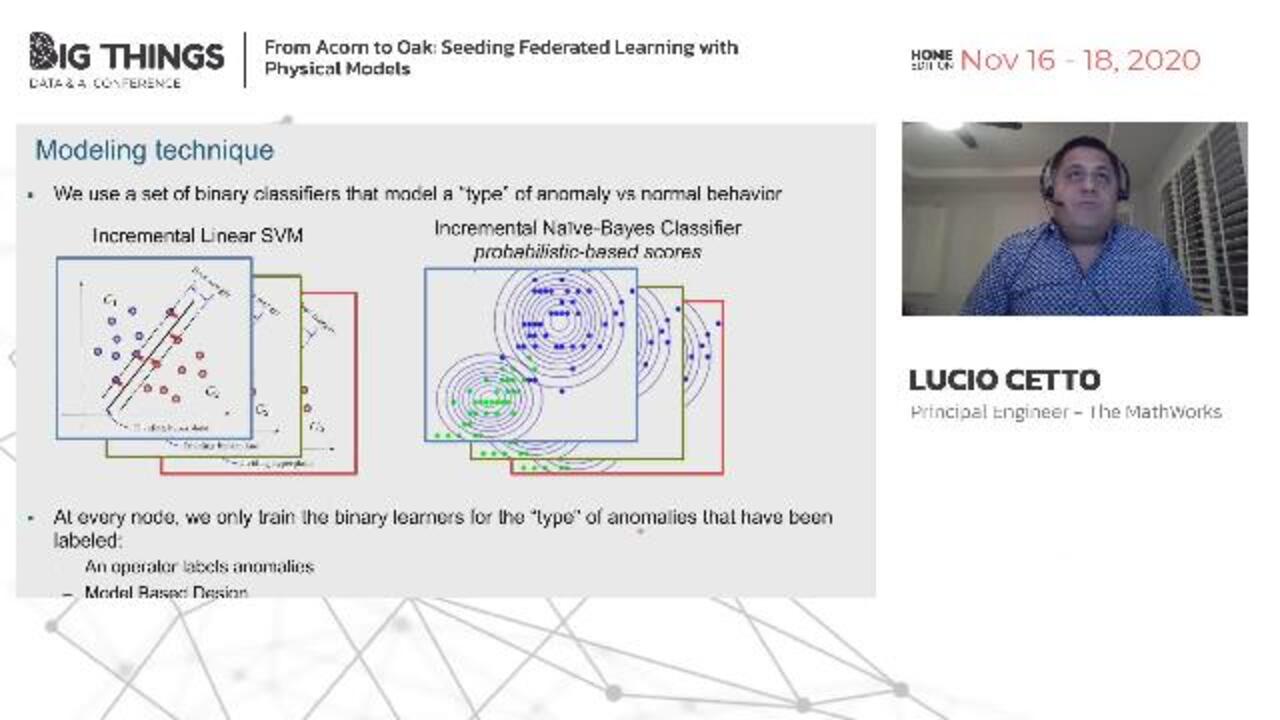
Now let's go to the modeling technique. To model the anomalies, we use a set of binary classifiers that model a given type of anomaly versus the normal behavior. We experimented with incremental linear support vector machines and incremental Naive-Bayes classifiers.
SVMs use stochastic gradient descent algorithm to update the model that start from a random hyperplane. Naive-Bayes classifiers update the summery statistics that represent an independent normal distribution. Naive-Bayes classifiers have the advantage that they can provide scores within a probabilistic framework. However, in our experiments, we found support vector machines to be more accurate for this type of problem.
Now, recall that not all the anomalies might be sufficiently represented at every node. Therefore, we only train those binary learners at every fan for which we have enough evidence. Let's make a small parenthesis about the labels.
We assume that these are provided by either two of the following ways. In the first case, an operator at a given factory might label the anomalies after experiencing them, retrofitting the information to the extreme. In the second case, we can consider an engineering team that might be starting the operation of the system under certain conditions at a given factory for which they have created a physical computer model that generates the data in the labels.
OK, let's see how the federation works. Let's assume that we have five nodes. Each node has been trained to its local data with an incremental learning algorithm. Model parameters and model weights are sent to the federation.
Weights is a value that contains the amount of evidence that we have observed for every anomaly at every local node. At the federation, we also keep global model parameters and global weight, denoted here by W naught and theta naught. We can simply compute model parameters using a weighted sum. In the case of the support vector machines, we compute new hydroplaned coefficients and bias. In the case of the Naive-Bayes, classifier we compute the weight itself for the standard deviation and the mean of every variable.
This computation might be synchronous or asynchronous. That is, we could update the global model as soon as we receive one model update. Or we can update in batches when we receive all model updates. Later, Peter is going to show you that we might also compute the global update at every node.
There are three important aspects to remember from this set up. The federation weights the model parameters using the amount of evidence for each type of anomaly. The federation is also in charge of reconciling new type of anomalies reported by the nodes. That means that, as new anomalies appear, the federation is going to update the inventory of known anomalies.
And as I already said, the global federation weight is capped at an arbitrary value. So we keep considering novelty introduced by the nodes. And then the new updates are sent back to the federates. And we have updated models of every-- of each one of them, of the fans.
Let's look at the accuracy of the classified model. Recall that, here, we are presenting the combination of two different paradigms-- incremental learning, and federated learning. To understand better the accuracy how the accuracy's impacted, we are going to explore the accuracy following these steps. So let's first start by looking at the accuracy of this simple linear SVM. This is an off-line linear SVM. So we get all the data, and we train at once on SVM.
Let's look at the comparison chart of the off-line linear SVM model. Accuracy here is computed by looking at a five-fold cross-validation over all the data for 10 fan systems that run over 24 hours. The first row and column represent the normal data, which you can see is obviously the most frequent condition.
Next we have three types of anomalies. The last row and column is the most infrequent condition. For us, it represents when we are observing two or more anomalies at the same time, which is a very rare condition. You can notice that we;re only missing to flag seven real normal anomalies on the not-overlapping cases.
Let's compare with an incremental support vector machine learner. Here, we measure the accuracy by looking at the forecast predictions after one period of 24 hours. Notice that we also miss very few anomalies. However, the model produces more false alarms.
Something worth to highlight is that we do not misclassify the anomalies. This is due to the nature of the modeling. That is, because we are using binary models between normal data and types of anomalies, having a misclassification would actually imply to have an error in two of the binary learners, which likelihood is much smaller. In summary, both the scenarios, we have very low false negative rate and false discovery rate, which is good.
OK, so now let's compare with the incremental federated learning approach. In this case, every local model only trains using one type of anomaly. The model is then sent to the federation, and we measure the accuracy using forecasted predictions on the federated model. We still miss few real anomalies.
But under these conditions, the false discovery rate increased approximately to one error every 200 flagged anomalies. Let me emphasize here that, while incremental model on the left needs to have access to all the data, the federated model on the right does not require to share or communicate any data. Instead, we only share the individual models, which is the federated learning paradigm.
Let me show you some of the typical errors that we are doing. The most common error is when two anomalies occur at the same time. We actually expected this type of error, as the amount of information is not really sufficient to tune up the model.
Another error occurs during the transients of the system. This was also expected. There are two possible workarounds for this that we did not fully implemented in our proof of concept. First, we could consider some small lags. We can also incorporate into the system scores or posterior probabilities to give the operator the idea of the significance of any detected anomaly.
To close the data analytics part of this presentation, let me show you how I will pack my algorithms we just described. There are three streaming functions. Two of them run locally at every node. And two updates the federated model. The anomaly predictor receives a stream with observations and feeds to an output stream with anomaly types and scores.
There are additional inputs to the classification model and the local conditions. While the first one is not required to be updated, the local conditions of every model or fan need to be updated. Recall that we keep the local conditions for each fan or system.
The function that incrementally learns the anomaly classifier has a similar signature with the difference that it also receives anomaly levels in the input stream. And it also updates the classification model with the updated parameters. Finally, the function that updates the federated model does not receive any data, labels, or local conditions. Inputs and outputs are only the classification models and the evidenced weights.
That's it. So now let me go back to Peter, who will tell us about how he configured the whole system and drive us through some implementation details. Thank you.
Thanks, Lucio, for explaining how the anomaly detectors turn analog signals into square waves, discrete state changes, which we need to count. That's the task we started from, after all-- scanning a set of real-time signals to create a predictive maintenance solution for cooling system operators. So let's take a look at that system and how we put it together so quickly in a little bit more detail.
The system essentially consists of three components-- a data source, an analytics engine, and a metrics dashboard. Connectors link or interact with the streaming service to manage the flow of messages through this pipeline. So that's a high-level, abstract view of the whole system. But it's not going to do anything until we fill in those abstractions.
Now we go back to the box and pull out all that sophisticated software. Simscape's multi-domain models generate our training data. MATLAB Production Server runs the training and classification algorithms. Redis preserves model parameters and other state. And InfluxDB and Grafana provide the dashboard.
To help you understand the tradeoffs in building a system like this, I thought we'd follow a signal on its journey through the pipeline. We'll stop at each of the three components. Or I'll highlight the challenges we faced and the choices we made. So let's take a look at the data generation.
This model allows me to vary the type and number of anomalies that occur during a given period. That variation raises the diversity of the scenarios I can throw at the trainer and increases the model's eventual accuracy. The colors you see indicate the different simulation domains.
And here's the simulator at work, generating about an hour's worth of labeled synthetic data. There's four charts here-- the three fan signals, and the load anomaly. And as it runs, you'll see what I mean by the anomaly labels.
The load anomalies are those that square away you see up in the top chart. In this section, you see several of our injected load anomalies. The case temperature rises, and the fan speeds up, drawing more power and compensation.
In the top chart, you see the labels, which are logical values, true during the time the anomaly is occurring, and false when everything's normal. That's why the anomaly signal is a square wave. Here is a voltage anomaly. See the large voltage drop in the bottom chart and the corresponding slowdown in fan speed. The temperature rises a little, but not enough to trigger an anomaly label.
Another thing to note is that each of these red areas is about 90 seconds wide, and therefore contains about 900 messages. Those square wave labels are chopped into lots of little pieces. That will be important later on. The next stop for our traveling signal is the classifier where we'll see how to design federation for high throughput.
Here's the anomaly detecting pipeline at one of our knowledge-sharing factories. Let's take a look inside that signal classifier. Each factory has a number of anomaly detectors, each using a model cached in a local data store. The parameters required for federation are stored in a shared data store that all the factories can access. The anomaly detectors run simultaneously, each processing signals from a unique set of fans.
When it comes time to integrate parameters from other factories to the local model, we'd like to pause each local detector for as short a time as possible. It turns out, if we incorporate federation into each detector, the atomic read-right guarantees of our data store make it possible for each detector to operate completely independently. As soon as any given detector determines it has seen enough data to change the parameters in a measurable way, it pulls new parameters from the shared store and updates its model.
Note that, at the same time, the green factory sent an update to the shared store. Did the federated detector get that update? It doesn't really matter. If not, it will get it on the next cycle. What matters is that the other detectors didn't have to stop and that the parameter data wasn't corrupted.
Then the federated detector updates the factory's model and the local store. And at the same time, a different detector loads the model. Again, we don't know if it got the pre- or post-update version, and it doesn't really matter. Since each detector can federate on its own, there's no need for a synchronization stage that would make some of them wait. And that keeps our throughput high.
Our signal's been turned into a square wave now, and it's traveling toward the dashboard. I'm going to use this last phase of our signal's journey to highlight a couple of subtle points regarding the time-series data. You'll need to at least consider these questions when you design your own data model. Though these two signals look like atomic indivisible units, the sampling rate divides them into segments. And that's how they're transported through the system-- as multiple messages.
Now you've probably seen the problem. The data parallelism required for high throughput can combine with network delays to scramble your signals. Most messaging services will give your data an ingest or arrival timestamp. That's the time the system accepted the message.
But to put these messages back together again, we need the event timestamp, which records the time that the signal is generated. So if you're generating time-series data, make sure your data model includes the event time. Now our signal is out in the wild, streaming across the network. We'll next encounter it at one of the connectors.
Our poor, little square wave's in four pieces, and the pieces are no longer in order. But the connector uses the message timestamp to reassemble it, placing it into little buffers called windows. And then it emits each window as a single larger message. In our case, the window heads to InfluxDB.
I hope you can see why using the event timestamp was important here. Note here that the anomaly signal splits across the window boundary. That's why the signal is decorated with those little squares. Those represent a single, unique signal identifier that the database queries use to join the windows back together.
So at last, a time-coherent window of data is bound for the dashboard. Let's take a look at what happens when it gets there. You've already seen video of the fan sensor data, so I thought I'd start with the classifier and then show you the metrics dashboard.
Here's the classifier during development. I'm using a MATLAB session as an Airside server, which is far too slow for production, but very convenient for debugging. Now we stopped at a break point. We can take a look at the fan input data, which is stored as a timetable.
There's a few of the values of the sensor signals. And after passing this data through the production functions, we can examine the results. I'd be better able to judge if these were correct if I were a better data scientist. But I trust Lucio's math, so I'm sure they are.
Now that same classifier is running in production on my eight-worker local server. Mostly, I wanted to highlight the throughput here, since each request contains about 1,000 messages. You can see we're processing between 6,000 and 8,000 messages per second.
And here is the dashboard. This is an overview of the cooling system-- number of anomalies at the top, that bar chart; and below it, a breakdown of the anomalies by fan. On the right, there's a timeline of total anomalies, showing when they occurred.
We can also drill down to see more detail about each individual fan. This is fan six. You can see the anomaly count and signal values that triggered them.
Now we're much further along in the run, and you can see another few fans have come online. Let's look at fan nine. It's only reporting one type of anomaly so far. On the right, you can see there are more downward spikes in the fan speed graph.
Now I'll go back to the main screen. And you can see we've accumulated a couple hundred more anomalies. So that's an overview of the Grafana dashboard we developed.
So this is what we've learned. The training data provided by physical models gives you a head start. And using off-the-shelf components lets you put a system together really quickly.
Federation makes your model smarter. And careful separations of concerns and interface design makes it easier to scale where necessary. Physical models provide the seed for rapid growth of a robust predictive maintenance classifier. Thank you very much.

Featured Product
Predictive Maintenance Toolbox


Select a Web Site
Choose a web site to get translated content where available and see local events and offers. Based on your location, we recommend that you select: United States.
You can also select a web site from the following list
Americas
- América Latina (Español)
- Canada (English)
- United States (English)
Europe
- Belgium (English)
- Denmark (English)
- Deutschland (Deutsch)
- España (Español)
- Finland (English)
- France (Français)
- Ireland (English)
- Italia (Italiano)
- Luxembourg (English)
- Netherlands (English)
- Norway (English)
- Österreich (Deutsch)
- Portugal (English)
- Sweden (English)
- Switzerland
- United Kingdom (English)