
Identifying Motor Faults using Machine Learning for Predictive Maintenance
Overview
Do you want to identify faults in equipment using sensor data? In this webinar, you will learn how to build data-driven fault detection algorithms for induction motors – even if you aren’t a machine learning expert. Starting with a dataset collected from motor hardware, we will walk through the end-to-end process of developing a predictive maintenance algorithm.
Highlights
Highlights include:
- Accessing and exploring large datasets
- Interactively extracting and ranking features
- Training machine learning algorithms
- Generating synthetic data from models
- Deploying algorithms in operation
About the Presenters
Dakai Hu joined MathWorks’ Application Engineering Group in 2015. He mainly supports automotive engineers in North America working on electrification. His area of expertise includes e-motor drives control system design, physical modeling, and model-based calibration workflows. Before joining MathWorks, Dakai earned his Ph.D in electrical engineering from The Ohio State University, in 2014, where he published 5 first-author IEEE conference and transaction papers in the area of traction e-motor modeling and controls.
Shyam Keshavmurthy is an Application Engineer who focuses on digital twins and AI. He has been at MathWorks for 3 years, and has 20+ years of experience in applying AI for quality and operational data. He has a Ph.D. in Nuclear Engineering and Computer Science.
Recorded: 16 Aug 2023
Hello, everybody. Welcome to this MathWorks webinar. Today our topic is identifying faults in electric motors with predictive maintenance. My name is Dakai Hu, and I'm part of MathWorks application engineering group, focusing on mostly the automotive industry. So here I am with my colleague Shyam today Hi, Shyam.
Hello, everybody. Hi, Dakai. I'm Shyam Keshavmurthy. I'm also with the application engineering team at MathWorks. I work in the areas of data science, signal processing, image processing, machine learning, and deep learning. So today I'm going to work with Dakai in trying to illustrate how we can build a predictive maintenance model.
Great. So at the time of this recording, we released this workflow example into our latest version of MATLAB. We hope that by going through the example, engineers like me who did not have a data science background can use this predictive maintenance workflow to quickly create machine learning models to predict faults in electric motors.
I want to also point out that, even if you are not focused on electric motors, you may still find something useful in today's webinar because this general workflow applies to other predictive maintenance applications as well. So here is an overview of what we are trying to do.
Our goal is to create and train a machine learning model to identify induction motor faults and, in particular, these broken rotor bar faults in induction motors. By going through this workflow, we eventually achieved higher than 95% classification accuracy against a validation dataset.
To create this example, we used a publicly available dataset obtained by researchers in an engineering lab in University of Sao Paulo, Brazil. So I want to give them the credit for providing the datasets. Well, to begin with, the first question you want to answer is, why this topic matters. Why are we doing predictive maintenance on electric motors?
Well, we know that every piece of equipment or machinery will eventually reach a point of failure when they're not maintained. The same applies to motors and, in this case, induction motors or asynchronous motors, as you can see in this picture here. Induction motors is one of the most popular type of motors in industrial applications today. There could be different types of faults occurring on those motors throughout their life cycles.
Some faults, such as winding faults like short circuit, will lead the motor to break down immediately. Some other faults like broken rotor bar faults, for example, will cause a gradual degradation of the motor. So having one of those rotor bars broken does not break down the motor immediately, but it will induce things like over currents in other rotor bars inside the motor and then cause them to deteriorate and eventually fail.
So as an electrical engineer, I'd like to detect those faults early when it happens and to provide sufficient lead time for motor repair or replacement. And that's why we do predictive maintenance.
Hey, Dakai. I have a question for you. Are there other streams of maintenance that people can use other than just predictive maintenance?
Yeah. Thank you, Shyam, for bringing up this topic. Yes, we do talk about different maintenance concepts. So the first one is what we call reactive maintenance. Reactive maintenance is when you basically just wait and wait until the motor breaks down completely, and then you come to fix it. So you are playing a reactive role when it comes to maintenance.
And then there's also this scheduled maintenance. And this is about performing regular checkups and maintenance on the motor before it fails, so similar to doing an oil change on your vehicle every 5,000 miles, which could be a good solution. But it could also mean that you might have wasted some remaining life of the motor that could still be usable.
So with predictive maintenance, which is what we are focusing today, we can possibly still use a part of that remaining useful life of the motor by trying to predict when it will fail and then perform maintenance before that. So that's the main difference between these three types of maintenance concepts. With that said, let's get into the main workflow.
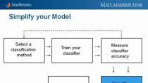
So this is a general predictive maintenance workflow that we follow. We begin with acquiring data that describes this induction motor in a range of healthy and faulty conditions. In our example, this step is already completed because we used a publicly available dataset. We then apply signal processing techniques to pre-process the data and determine the independent signals we need to generate features.
Then we move on to use these features to develop machine learning models. Here we could iterate on model development by trying different model inputs or features. When we are satisfied with the model accuracy for this application, then we can consider deploying the model and integrate it into either an embedded system or some other production platforms, which is the ultimate goal for developing those types of machine learning models.
So in our example, we will mainly focus on data processing, generating features, training the model because that's where engineers like me tend to spend most of our time on in a predictive maintenance workflow. So here's just a little more background information about broken rotor bar faults because that is the condition we want to predict today using a machine learning model.
For score cage induction motors, the rotor side comes with conductive bars, usually made from copper or aluminum. So these bars come break because of conditions mainly caused by intense thermal, mechanical, and environmental stress. In this experimental setting where this dataset was obtained, up to four of those bars were intentionally ruptured by a drill.
And then different loads were added for each broken rotor bar condition. So altogether, the raw dataset covers 400 experiments. Data analysis is obviously a key step for any predictive maintenance workflows.
This original dataset from the website is about 7 gigabytes, which can be easily processed in MATLAB using data stores and other infrastructure. But we don't really need all of them to extract useful features because there's a lot of repetitions in the original experiment. So eventually, we decided to select 80 out of the 400 experiments to extract features.
Now, let's move on to MATLAB to actually look at the example. So we created this workflow example, as a MATLAB live script. For those of you who haven't seen live script before, it is a relatively new way of writing code in MATLAB. It can include not only code, but also add in richly formatted text, pictures, diagrams, hyperlinks-- basically everything you need to tell your story.
So here in this lab script, it first explained what the original dataset consists of. And also here is a link where you can download a shorter version of the original dataset. So after taking the dataset and unzipping these files, then here we need to rearrange and label the data based on basic no fault conditions, for example here, healthy one rotor bar broken, two bar broken, all the way to four bar broken.
That's the health conditions we want to label the data for. After that, we need to create this thing called File Ensemble Datastore. We need to use this to basically access different data files. As someone who is new to predictive maintenance, this is actually my first time working with the File Ensemble Datastore.
So here's a question for my colleague, Shyam. Hey, Shyam. What is a File Ensemble Datastore object, and how can I use it?
Dakai, that's a great question. Of course, you're familiar with datastores. A datastore is a mechanism in MATLAB that allows you to access large sets of data as files, even though the data may not fit into your memory. File Ensemble Datastore is a good way of representing your data, where you are storing the labels along with the variables of interest that you want to process.
So basically, file ensemble datastore puts the metadata associated with the data along with the data and creates a table of tables. In our case here, probably you'll have a table of timetables.
Thank you, Shyam. I really like it when you called the File Ensemble Datastore as the table of tables. That's easy to remember. And as we look through the File Ensemble Datastore object, indeed I can find timetables here within a table. So it's all about helping engineers like me to better organize our data for this predictive maintenance workflow.
So using the File Ensemble Datastore to process all the data we have, we eventually settled with two sets of signals to extract features from. One of them is this one, which is the envelope of a band-pass filter evaporation signal. So here you're looking at a collection of all 80 experiments. And they're grouped by this condition variable.
And then the second is this envelope spectrum of a band-pass filtered electrical signal. So here we are doing spectral analysis because each fault condition has its own signature in not only the time domain, but also the frequency domain. And here in the example, in the end you will see that we provided support functions for you to process these two sets of signals in both domains.
For example, here we are calculating this band-pass filtered corroboration signal, and then we're calculating the envelope of that. And down here, we're calculating directly the envelope spectrum of this band-pass filtered current signal. So here I've mentioned envelope a couple of times. The actual technical term should actually be envelope analysis.
And the reason that we are doing this type of envelope analysis here is because it is an effective way of modulating the original time domain signal in order to uncover hidden frequency components associated with fault conditions.
So one question I had when I look at lab analysis is how to choose the appropriate band-pass filter, which is a necessary step before getting the signal envelope. For example, here we are selecting a frequency band between 900 and 1,300 for this filter. But where does that frequency band come from? Again, that's a question for my colleague Shyam, who had a ton of experience in signal processing.
Shyam, could you explain to our audience in this application, how can I select the right frequency band for my band-pass filter?
Sure, Dakai. I generally use the data to inform me on what band-pass that I need to select. So what I did was, as an initial step, I took some sample profiles-- one with a healthy dataset one, with a single rotor bar broken, the two rotor bar broken, and the four rotor bar broken. I took this dataset and I passed them through what is called as wavelet transform, which is part of our Wavelet Toolbox.
It allows you to represent data both in terms of time as well as frequency. It allows me to pictorially look at the dataset without looking at just the plots that we had seen before. And that pictorial representation is called scalogram. So let's look at this scalogram for the four profiles. As you can look at these four scalograms, you can see that there is quite a bit of energy anywhere between 700 to 1,500 hertz.
And it is at all the time locations, and the energy seems to be banded in that area. Of course, you have a lot of noise in the low frequency areas, which you don't want to bring it in because it'll confuse what the analysis we are doing.
So what we are going to do is we are going to select only that data that exists anywhere between 900 to 1,300 hertz, leaving away some margin for eliminating the spiky noise that you get at the high frequency and this background noise that you are getting at the low frequency. That's how you select that frequency band using the data that we have collected before.
Thank you, Shyam, for providing such a detailed explanation behind this band-pass filter design. I just want to remind everyone that we did all of these signal processing because we eventually wanted to use these process signals to generate features or model inputs to the machine learning models. And to do that, I can use this app called Diagnostic Feature Designer, which can be directly accessed from the Command Window.
Let me do that here, so by typing Diagnostic Feature Designer-- Or I can access it here in the app gallery, which is around here.
Once inside the Diagnostic Feature Designer, similar to most of MATLAB apps, the workflow generally goes from left side of the toolbar to the right. So we click start a New Session. And in this window, you select source for the data. So here I'm going to select the ensemble dataset object that's created previously.
[COMPUTER DINGING]
So I'm going to uncheck a few buttons here. Keep in mind that we only need two sets of signals to extract features. One of them is this envelope of the band-pass filter evaporation signal, which is a time domain data. And the second one is the envelope spectrum of a band-pass filtered electrical signal, which is spectrum data. So let me first uncheck the others here.
And for the spectrum data, we have to actually specify it here as spectrum. In column 1 is the frequency. So in this case, the electrical signal was originally sampled at 50 kilohertz. I also wanted to include the health variable, which in this case is a condition variable. And I'm going to uncheck the load. So hit Import.
Inside the Diagnostic Feature Designer, you can visualize all the signals you brought in. Just highlight the signal, like this one here, and click Signal Trace. Here we are looking at the envelope of the band-pass filter vibration signal for all 80 experiments.
Now the signal is loaded, I can zoom in here on the y-axis. And let me also group the signal by the health condition. I can also zoom in on the time axis and only look at a small fraction of the time domain data.
So here, if you look at the envelope signal, each envelope signal-- so with each color, it indicates a different health condition in the envelope signals. I can also visualize this frequency domain signal, which is the power spectrum of band-pass filtered current. I can highlight that and go in here and hit Power Spectrum.
So after inspecting the time and frequency domain signals, we can now take different approaches to generate features from them. For this time domain data, we can come to this dropdown menu here. And there are different options to choose from. You can create Custom Features, Nonlinear Features, Time Series Features, Rotating Machinery Features, Model-Based Features, so on and so forth.
In my case, I'll just stick with the most basic one, Signal Features. And you'll see here is a common list of statistical features for you to choose from. So if you are like me, who is new to data science, one way to navigate through all these feature options is to apply a brute force approach. And then come here and click this Auto Features button.
This will generate an exhaustive list of features based on your signal type. For example, this window will pop up and you will see that Auto Features will generate altogether 90 different features for this time domain data. So I'm just going to hit Compute. This process overall would take a couple of minutes, so in a video probably we'll have to speed it up a bit.
So while it is calculating, Shyam, could you explain how this Auto Feature works compared to, let's say, manually selecting or calculating features.
A great question, Dakai. A lot of times what happens is that when you are selecting features manually and calculating features manually, you use your domain knowledge to pick features up. And generally, we pick features up that may be correlated with each other. They're not going to add value to your predictability. And you may miss those features that are important in terms of predictive power.
So in the grand scheme of things with Auto Features selection, which does exhaustive feature selection, it looks for two things. It looks for correlation between features and also the causality of features. Means that how a feature affects its predictive power. Based on those two metrics it is going to rank order the features. Depending on how much computational power you have, you can pick any number of features that are already rank order for you.
The higher the rank, the more predictable those features would be. So that's the advantage of using Auto Features selection. But some applications you may have to bring in some custom features and build your own features because the domain knowledge is super important in those areas. So Auto Feature is an easy button for getting the features selected and organized.
Thank you, Shyam. So at the end of this process, you'll see a whole set of features auto-generated and ranked by this One-way ANOVA test. The higher the score here, the more relevant the feature is in predicting the condition. In addition to automatically generating features in the demo, it will also walk you through the steps of generating some custom fault features based on envelope spectrum of the current signal.
For example, here we can enhance peak regions of interest from this spectral plot. And we are focusing on those peaks of the spectra because that's where the energy of the system is concentrated. So it's very reasonable to use these frequency regions to extract custom features.
OK so now I got all the features I need actually I've got way more features than I need I can then select and export the features from the Export button here you can export the features directly to MATLAB workspace or to a Classification Learner app. Or it can also generate code inside a MATLAB function that can reproduce the calculation of these features.
So in my case, I'm going to export the features directly to the Classification Learner app in MATLAB. And you see this window popping up. Here I am going to select the top 10 features to export.
So after clicking the Export button, you will see this New Session from file window popping up. Here's where you can basically set up a validation scheme to make sure that you are not overfeeding the data. And here you can also withhold your testing dataset if you want to. In this case, I'm going to go with the default of having five cross-validation folds. And I'm not going to set aside a testing data setlet. Let me hit Start Session.
Now, the features are in the Classification Learner app. So if I want to, I can go through the Feature Selection here again and only keep the features I actually need. So my goal here is to use the least number of features, or independent features, rather, that can help me achieve the desired model accuracy. This is important, especially if I'm trying to deploy the final algorithm to an embedded platform that has limited computing power.
I need to seriously consider how many features our model inputs the device can accommodate. So in this example, I'm going to stay with the top 10 features here. I'll hit Save and Apply. OK. So once we have all of our features selected, our next step here is to choose the right models to train.
So if you have some domain knowledge in machine learning, you could come in here and select any one of these classification algorithms. Or if you're like me, who does not have much domain knowledge in machine learning, you could use this All option. So this All option basically provides you all available models to train.
So with that, I can just hit Train All. Overall, this training process can be speeded up by enabling this Use Parallel option, which basically relies on the Parallel Computing Toolbox to distribute the model training to different course of your local machine.
OK. Now, I finish this training. I can come here and look at all the models. And it's possible that some models will fail to converge because of many reasons. It could be because it doesn't have the proper hyperparameter. Or maybe that particular model is just not suitable for a multi-classification problem. So basically, with that I can also come in here and select how to rank those trained models.
So here I'm selecting this validation accuracy. And based on this criterion, the highest accuracy model of validation-- accuracy model is this weighted end model, which achieved 97.5% validation accuracy. So if you'd like to do some further investigation of the trained model, you can come here and look at the model summary and look at some of the hyperparameters.
You can also plot some typical machine learning plots, such as the Confusion Matrix. So from here I'm going to ask, again, my colleague Shyam to explain what the Confusion Matrix is and some other terminologies that you might encounter while evaluating your model performances.
Dakai, Confusion Matrix is a pictorial way of representing the results coming out of a prediction from a machine learning model. Basically, it's a plot of what the predictions are with respect to what the labels were because you're working with the label dataset here. So for example, in healthy condition you had 16 datasets that went for testing. And out of which, 16 were predicted to be healthy and 16 were actually labeled as healthy.
That's a great result. That's 100%, right? And the percent true positives means that if something is positive, we see it as true positives. Whereas if you go to a broken bar number 2, and we had some 18 cases-- two of them got misclassified. And here that's why you have a percentage of misclassification that is happening. And the same happened with a single broken bar. There was a little confusion.
That's why the name Confusion Matrix comes into being because the model does get confused. And what do you get out of it is a true positive ratio and a false negative ratio. You don't want too many false negatives or too many of false negatives in the entire picture. You want more of true positives in the picture.
So overall, we got 97.5%, which is way down because of the two factors that went into a single broken bar and two broken bar. The rest of it was 100%. So that's a deep performance index that a Confusion Matrix provides for us.
Thank you, Shyam. OK. So now we have our trained model. What can we do with it? So that model trained here in this Classification Learner app can be used in MATLAB to make new predictions. All I have to do is to hit this Export Model button, and I can export model directly to MATLAB workspace.
So I just go with a default trained model name and I'll go to MATLAB. So inside here, you'll see in a base workspace. Trained model showed up as a model structure.
So other than using the model in MATLAB, it can actually be brought into Simulink as well. So actually, Shyam, could you talk more about other deployment options engineers may have?
Dakai, you might have noticed in your Classification Learner when you tried exporting there is also an option for exporting it as a function.
Yes.
There may be many ways people can use that. As you said, you can use it in Simulink. And the other way you can do it is you can also export the model as a function. So when you export the model as a function, now it's available for you as a MATLAB function that can be consumed by various different applications.
So generally, there are two paths people use for deploying the models. One is for deploying the model onto an enterprise system or deploying the models through an embedded hardware. When you are trying to deploy models to an embedded system, basically use our code of products.
When it comes to enterprise deployment, you can take two options. You can compile that as a runtime executable. And along with the MATLAB runtime, you can put it as a docker container for your data pipeline to consume. Or you can make it into your plugin to an Excel spreadsheet. Or you can make it as a web app server. And in larger enterprise systems where you are running it in cloud, generally you would use a Compiler SDK product that we have, make it into a microservice.
This microservice allows you to have a HTTP Endpoint for it so you can pipe in the data and build a dashboard. The other way is people do it is just do a plugin library for C++, Java, Python, or .net, where most of the data pipeline exists in those platforms and MATLAB algorithms, both for pre-processing the dataset feature extraction as well as model prediction can be applied.
One of the best uses of it is through our production server, where we create a REST API for both the feature extraction as well as for prediction. These REST APIs can be plugged into any of the dashboards that you have. And you can render the results coming out of prediction. So overall, there are multiple ways of utilizing MathWorks tools to accomplish the business value you want to get out of the Predictive Maintenance Toolbox.
Thank you, Shyam. Yeah, it's great to know that these trained models can be deployed to all these different platforms. I can see how useful that will be for identifying those electric motor faults because these motors are used in a lot of different industries, from automotive to aerospace to industrial automation and machinery.
OK. With that said, I think we are close to the end of this webinar. So let's do a quick summary before we move on to our live Q&A session. So in summary, in this webinar we went through the workflow of creating a predictive maintenance model to identify electric motor faults. We started by looking at the collected dataset, which includes evaporation data and the electrical data.
Then we processed it using different techniques, things like band-pass filtering, envelope analysis, and also spectral analysis. Then we walked through identifying key features using this Diagnostic Feature Designer app and then trained and evaluated machine learning models inside the Classification Learner app.
In the end, my colleague Shyam briefly talked about different deployment options after creating features and also the machine learning models. So that concludes our webinar session today. Thank you, everyone, for tuning in. And thank you very much, Shyam, for participating. Goodbye, everyone.
Thank you. Goodbye.
Related Products
Learn More
Featured Product
Predictive Maintenance Toolbox


Select a Web Site
Choose a web site to get translated content where available and see local events and offers. Based on your location, we recommend that you select: United States.
You can also select a web site from the following list
Americas
- América Latina (Español)
- Canada (English)
- United States (English)
Europe
- Belgium (English)
- Denmark (English)
- Deutschland (Deutsch)
- España (Español)
- Finland (English)
- France (Français)
- Ireland (English)
- Italia (Italiano)
- Luxembourg (English)
- Netherlands (English)
- Norway (English)
- Österreich (Deutsch)
- Portugal (English)
- Sweden (English)
- Switzerland
- United Kingdom (English)