Analyze Clock Buffer Using Mixed-Signal Analyzer
This example shows how you can use the Mixed-Signal Analyzer app to analyze a clock buffer circuit and understand the effect of varying corner points using trend charts. You can also update the analyses with modified simulation data and export the results to a file.
Export Data from Cadence
The output is setup for the simulation in the Cadence® ADE Assembler Maestro view:

In this setup one node (/in) is probed for waveforms. There is one expression to generate the metrics data (delay_in_o2). To generate a .mat file at the end of the simulation run, a MATLAB® expression is added that calls the adeinfo2msa function in this format:
adeinfo2msa('metricsOnly',false,'import2msa',false,'fileName','clockBuffer1.mat')
Altogether 16 cases (2 sweeps of 8 Corners) of simulation runs are performed. Once simulation finishes in Cadence, the generated .mat file is saved in the present working directory.
Import Data to Mixed-Signal Analyzer
Open the Mixed-Signal Analyzer app from the app gallery or MATLAB command prompt.
mixedSignalAnalyzer
To import the .mat file containing the Cadence simulation data, click the Import button in the app toolbar, select File..., and then select ClockBuffer1.
The transient and AC analysis simulation data, analysis waveform, and performance metrics shows up in the Data panel.

Plot and Analyze Data
To plot the transient waveform, click on /o2 under the tran section in the Data panel, then click the Display Waveform button in the Plot tab.

You can plot specific cases of the waveforms currently in focus. For example, to filter out the 1.2V of vdd, click the Filter button in the Plot Options panel and deselect 1.2 V the newly opened dialog box. Click the OK button to update the waveforms. The plot now shows the 8 out of 16 cases of waveforms representing waveforms for 0.9V cases.

To find the overshoot values for the /o2 waveforms, keep /o2 selected and select the yMaximum function from the built-in Analysis section in the Analysis tab. The calculated metrics are added under Analysis Metrics in the Data panel.

Add Custom Analysis
You can also add your custom analysis function using the Add Analysis button. We will demonstrate that by computing slew-rate and frequency of the clock buffer output.
Slew-rate: To add a custom analysis function that computes the mean of the slew rates of the transient output waveform we will be applying Signal Processing Toolbox function slewrate
.While keeping/tran/o2selected click the Add Analysis button. In the newly opened pop-up window, select Enter MATLAB expression. Enter the expression:mean(slewrate(y,x))and click OK.

This produces the mean of the slew rate data of the output transient waveform for all cases under the Analysis Metrics section in the Data panel.

2. Frequency: To compute frequency of the clock buffer output we will make use of another Signal Processing Toolbox function called instfreq. The steps remain the
same as above. Select /tran/o2 and click Add Analysis followed by selecting Enter MATLAB expression radio button.
Next, enter the expression: mean(instfreq(y,x)) and click OK.

This produces the mean of the frequency of the output transient waveform for all cases under the Analysis Metrics section in the Data panel.

You can create multiple custom MATLAB expressions or analysis functions and save them for future use.
Plot Trend Charts
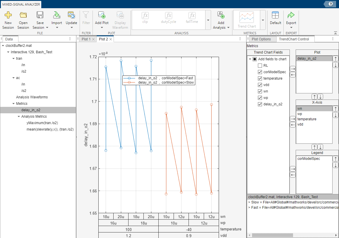
To get better insight about certain parameters, you can add a trend chart by clicking Trend Chart button in the Metrics tab. For example, to find the trend in the delay metrics data, select delay_in_o2 under Metrics section in the Data panel and click the Trend Chart button.

The trend chart shows the delay between the output (/o2) and the input (/in) signals as various process corners are varied. You can modify and add new fields to the trend chart.
From the Plot Options panel, select corModelSpec and vdd in the Trend Chart Fields. The fields are added to the x-axis layers.

You can move parameters inside the x-axis box using the arrow buttons to change the sequence in which they are placed. You can also move parameters from x-axis to legends and vice-versa until you see a trend emerging. At that point, you can draw conclusion about the metrics data and its effect on various design parameters and process corners.

Update Data with Modified Design Simulation
These analyses performed on waveform and metrics data help in making design decisions for the circuit you are working on. You can go back to Cadence after you are satisfied with the analysis results to make changes to your design and perform another simulation run. After importing the modified simulation data, use the Update button in the Mixed-Signal Analyzer app to refresh all the plots and figures in the current working session. You do not have to re-configure your trend chart, compute analyzed metrics, waveforms and perform filtering on the waveforms the next time around when you generated the next set of simulation results for the same design.
For example, you can have a second set of simulation results extracted from Cadence and saved under a .mat file named clockBuffer2.mat. Now, in a Mixed-Signal Analyzer app working session, where you have all the plots and figures from the first simulation run present, select Update > File... and select clockBuffer2.mat.

A new dialog box opens asking you to select the data to be refreshed. In this case, Interactive.128 data (from ClockBuffer1.mat file) is refreshed/updated with Interactive.129 (from clockBuffer2.mat file) data.
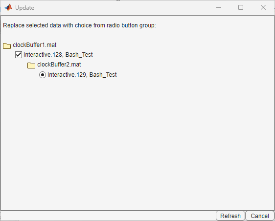
Click the Refresh button to update the waveforms and trend chart with the data from the new simulation run.
Export to Script
You can click the Export > Export To Script button to automatically generate a MATLAB script that contains the information about the data source, waveform data, and generated plots. You can use the script to programmatically access these data from the command window.
Export to Report
Once you are satisfied with the results, you can export it as a report in either ppt, pdf, doc, or html file format. You can also rename each plot for your convenience while generating the report using the Plot > Rename Plot option from the app toolbar. You can also select the format, name, and location of the report file. If the MATLAB has been launched through Cadence ADE then by default, report gets saved in the maestro/documents folder of the design unless one specifies another location.