Measure Signal Similarities
R2026bThis example shows how to measure signal similarities using data from audio recordings, vibration sensors, and temperature monitors. You will learn how to:
Compare signals with different lengths or sample rates.
Determine if a signal is present in a measurement.
Measure and correct delays between signals.
Compare the frequency content of two signals.
Detect periodicities within a signal.
Resample and Compare Audio Signals
Suppose you want to identify a song by comparing it against a database of known recordings. To identify the song, you can compare it against the stored templates and find the best match. For this example, load a database of audio signals. Plot two reference signals and the signal under test to visually inspect the signals side by side.
load relatedsig

tiledlayout("vertical")
ax1 = nexttile;
plot((0:numel(T1)-1)/Fs1,T1,"k")
ylabel("Template 1")
grid on
ax2 = nexttile;
plot((0:numel(T2)-1)/Fs2,T2,"r")
ylabel("Template 2")
grid on
ax3 = nexttile;
plot((0:numel(S)-1)/Fs,S)
ylabel("Signal")
grid on
xlabel("Time (s)")
linkaxes([ax1 ax2 ax3],"x")
axis([0 1.61 -4 4])
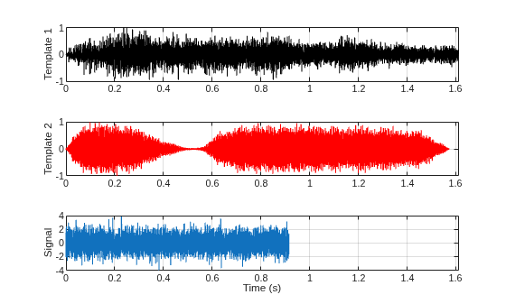
At first glance, the signal under test does not appear to match either template. However, this apparent mismatch is misleading. The signals have different lengths and sample rates, which distorts the visual comparison. Also, audio in databases is commonly stored at a low sample rate to occupy less memory. List the sample rates of the audio signals from the database.
[Fs1 Fs2 Fs]
ans = 1×3

        4096        4096        8192
You can cross-correlate signals with different lengths, but they must have identical sample rates. To equalize the sample rates, use the resample function to resample the signal with the lower sample rate. The resample function applies an anti-aliasing (lowpass) FIR filter to the signal during the resampling process.
[P1,Q1] = rat(Fs/Fs1);          % Rational fraction approximation
[P2,Q2] = rat(Fs/Fs2);          % Rational fraction approximation
T1 = resample(T1,P1,Q1);        % Change sample rate by rational factor
T2 = resample(T2,P2,Q2);        % Change sample rate by rational factor
Identify Signal Using Cross-Correlation
Cross-correlate signal S to templates T1 and T2 using the xcorr function to determine if there is a match.
[C1,lag1] = xcorr(T1,S);
[C2,lag2] = xcorr(T2,S);

tiledlayout("vertical")
ax1 = nexttile;
plot(lag1/Fs,C1,"k")
grid on
title("Cross-Correlation Between Template 1 and Signal")
ax2 = nexttile;
plot(lag2/Fs,C2,"r")
grid on
title("Cross-Correlation Between Template 2 and Signal")
xlabel("Time(s)")
axis([ax1 ax2],[-1.5 1.5 -700 700])
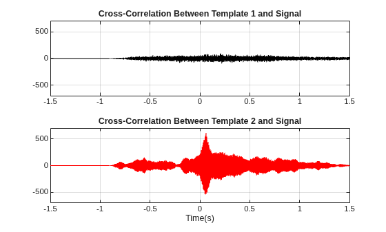
The cross-correlation with T1 shows no significant peak, indicating no match. The cross-correlation with T2 shows a strong peak, indicating that S is present in this template.
[~,I] = max(abs(C2));
SampleDiff = lag2(I)
SampleDiff =
499
timeDiff = SampleDiff/Fs
timeDiff =
0.0609
The peak of the cross-correlation implies that the signal is present in template T2 starting after 61 ms. In other words, template T2 leads signal S by 499 samples as indicated by SampleDiff. The next section shows how to use delay information to align signals.
Measure and Correct Delays in Vibration Sensor Data
Assume you are collecting data from three sensors recording vibrations caused by cars on both sides of a bridge. Assume that the sensors work at the same sample rate. Because the sensors are at different positions, signals from the three sensors arrive at different times. Plot the signals.
tiledlayout("vertical")
ax1 = nexttile;
plot(s1)
ylabel("s1")
grid on
ax2 = nexttile;
plot(s2,"k")
ylabel("s2")
grid on
ax3 = nexttile;
plot(s3,"r")
ylabel("s3")
grid on
xlabel("Samples")
linkaxes([ax1 ax2 ax3],"xy")
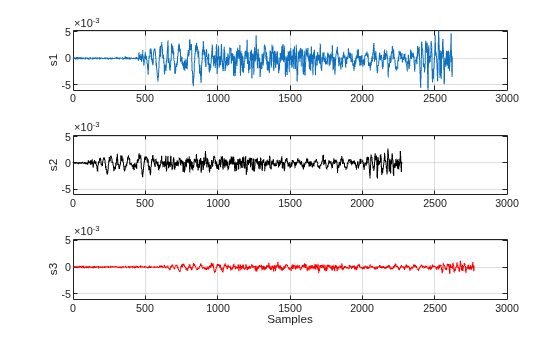
Use the finddelay function to find the delay between two signals.
t21 = finddelay(s1,s2)
t21 =
-350
t31 = finddelay(s1,s3)
t31 =
150
t21 indicates that s2 is advanced with respect to s1 by 350 samples, and t31 indicates that s3 is delayed with respect to s1 by 150 samples. You can use these delay values to manually shift the signals and align them. You can also use the alignsignals function to align the signals by delaying the earliest signal.
[s1,~,~] = alignsignals(s1,s3);
[s2,~,~] = alignsignals(s2,s3);

tiledlayout("vertical")
ax1 = nexttile;
plot(s1)
grid on
title("s1")
axis tight
ax2 = nexttile;
plot(s2)
grid on
title("s2")
axis tight
ax3 = nexttile;
plot(s3)
grid on
title("s3")
axis tight
linkaxes([ax1 ax2 ax3],"xy")
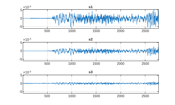
The three signals are now aligned in time and you can compare them directly.
Compare Frequency Content of Audio Signals Using Spectral Coherence
The previous sections compared signals in the time domain. You can also compare the frequency content of signals by computing the power spectra of two signals to see which frequencies are present in each signal. Plot two audio signals, sig1 and sig2, and their power spectra.
Fs = FsSig;

[P1,f1] = periodogram(sig1,[],[],Fs,"power");
[P2,f2] = periodogram(sig2,[],[],Fs,"power");

tiledlayout
t = (0:numel(sig1)-1)/Fs;
nexttile(1)
plot(t,sig1,"k")
ylabel("s1")
grid on
title("Time Series")
nexttile(3)
plot(t,sig2)
ylabel("s2")
grid on
xlabel("Time (s)")
nexttile(2)
plot(f1,P1,"k")
ylabel("P1")
grid on
axis tight
title("Power Spectrum")
nexttile(4)
plot(f2,P2)
ylabel("P2")
grid on
axis tight
xlabel("Frequency (Hz)")
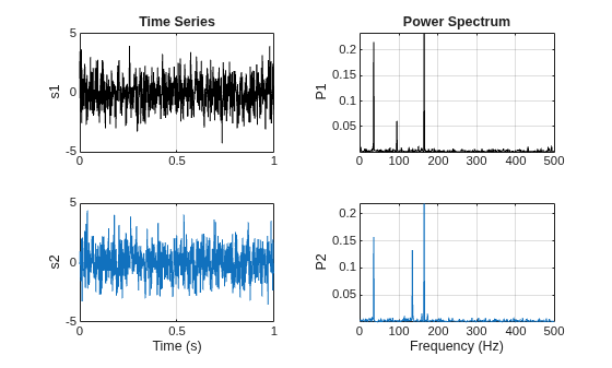
The power spectra show which frequencies are present in each signal individually, but not whether those components are related across the two signals. Spectral coherence enables you to identify frequency-domain correlation between signals. Use the mscohere function to compute spectral coherence. Values close to 1 indicate correlated components, values close to 0 indicate uncorrelated components. To further characterize the relationship, use the cpsd function to compute the cross-spectrum phase. Cross-spectrum phase estimates the relative phase lag between correlated components.
[Cxy,f] = mscohere(sig1,sig2,[],[],[],Fs);
Pxy = cpsd(sig1,sig2,[],[],[],Fs);
phase = -angle(Pxy)/pi*180;
[pks,locs] = findpeaks(Cxy,MinPeakHeight=0.75);

tiledlayout("vertical")
nexttile
plot(f,Cxy)
title("Coherence Estimate")
grid on
hgca = gca;
hgca.XTick = f(locs);
hgca.YTick = 0.75;
axis([0 200 0 1])
nexttile
plot(f,phase)
title("Cross-Spectrum Phase (deg)")
grid on
hgca = gca;
hgca.XTick = f(locs);
hgca.YTick = round(phase(locs));
xlabel("Frequency (Hz)")
axis([0 200 -180 180])
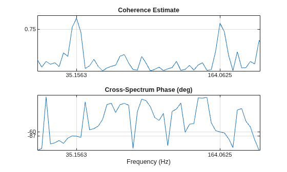
The coherence estimate confirms that sig1 and sig2 have two correlated components around 35 Hz and 165 Hz. The phase lag at 35 Hz is close to –90 degrees, and the phase lag at 165 Hz is close to –60 degrees.
Detect Periodicities in Temperature Data
The previous sections compared two or more signals to each other. You can also compare a signal to itself to detect repeating patterns. Consider a set of temperature measurements taken every 30 minutes for about 16.5 weeks in an office building during winter.
load officetemp.mat

Fs = 1/(60*30); % Sample rate is 1 sample every 30 minutes
days = (0:length(temp)-1)/(Fs*60*60*24);

figure
plot(days,temp)
title("Temperature Data")
xlabel("Time (days)")
ylabel("Temperature (Fahrenheit)")
grid on
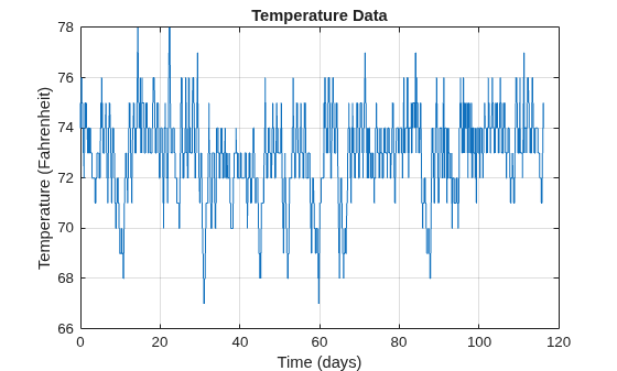
Because the temperatures in this data set hover in the low 70s, the large absolute values can dominate correlation analysis and obscure the small periodic fluctuations of interest. Removing the mean isolates these fluctuations. The xcov function removes the mean of the signal before computing the cross-correlation and returns the cross-covariance. Limit the maximum lag to 50% of the signal to get a good estimate of the cross-covariance.
maxlags = numel(temp)*0.5;
[xc,lag] = xcov(temp,maxlags);

[~,df] = findpeaks(xc,MinPeakDistance=5*2*24);
[~,mf] = findpeaks(xc);

figure
plot(lag/(2*24),xc,"k", ...
     lag(df)/(2*24),xc(df),"kv",MarkerFaceColor="r")
grid on
xlim([-15 15])
xlabel("Time (days)")
title("Auto-Covariance")
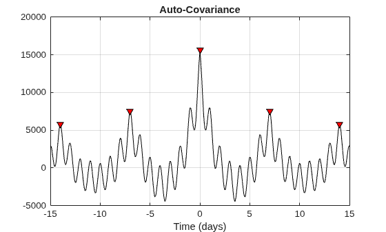
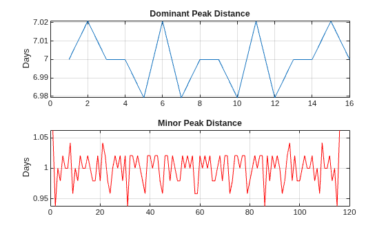
Observe dominant and minor fluctuations in the auto-covariance. Dominant and minor peaks appear equidistant. To verify if the peaks are equidistant, compute and plot the difference between the locations of subsequent peaks.
cycle1 = diff(df)/(2*24);
cycle2 = diff(mf)/(2*24);

tiledlayout
nexttile
plot(cycle1)
ylabel("Days")
grid on
title("Dominant Peak Distance")
nexttile
plot(cycle2,"r")
ylabel("Days")
grid on
title("Minor Peak Distance")
mean(cycle1)
ans =
7
mean(cycle2)
ans =
1
The dominant peaks are spaced seven days apart, reflecting weekly cyclic behavior of temperatures dropping during weekends and rising during weekdays. The minor peaks are spaced one day apart, reflecting daily cyclic behavior of temperatures dropping at night and rising during the day. Both patterns are consistent with a temperature-controlled building on a seven-day calendar.
See Also
alignsignals | cpsd | finddelay | findpeaks | mscohere | xcov | xcorr

