Compare Data Sets by Overlaying Area Graphs
This example shows how to compare two data sets by overlaying their area graphs.
Overlay Two Area Graphs
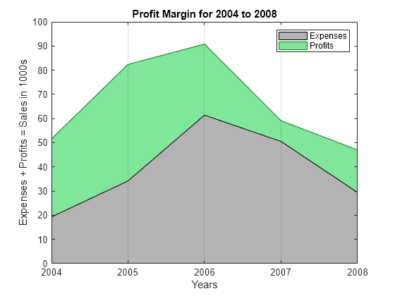
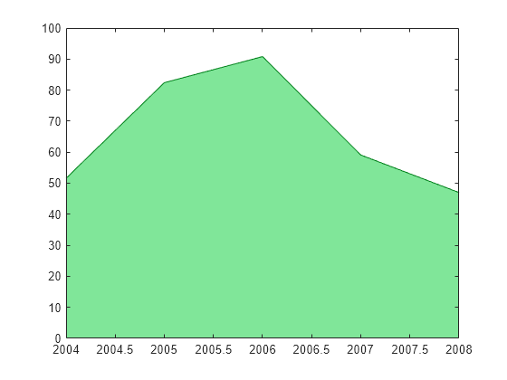
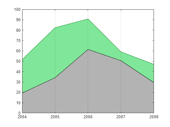
Create the sales and expenses data from the years 2004 to 2008.
years = 2004:2008;
sales = [51.6 82.4 90.8 59.1 47.0];
expenses = [19.3 34.2 61.4 50.5 29.4];
Display sales and expenses as two separate area graphs in the same axes. First, plot an area graph of sales. Change the color of the area graph by setting the FaceColor and EdgeColor properties using RGB triplet color values.
area(years,sales,'FaceColor',[0.5 0.9 0.6],'EdgeColor',[0 0.5 0.1])
Use the hold command to prevent a new graph from replacing the existing graph. Plot a second area graph of expenses. Then, set the hold state back to off.
hold on
area(years,expenses,'FaceColor',[0.7 0.7 0.7],'EdgeColor','k')
hold off

Add Grid Lines
Set the tick marks along the x-axis to correspond to whole years. Draw a grid line for each tick mark. Display the grid lines on top of the area graphs by setting the Layer property. Use dot notation to set properties.
ax = gca; % current axes
ax.XTick = years;
ax.XGrid = 'on';
ax.Layer = 'top';
Add Title, Axis Labels, and Legend
Give the graph a title and add axis labels. Add a legend to the graph to indicate the areas of profits and expenses.
title('Profit Margin for 2004 to 2008')
xlabel('Years')
ylabel('Expenses + Profits = Sales in 1000s')
legend('Profits','Expenses')