Design a Mask Dialog Box
This example shows how to create a mask dialog box using the Parameters & Dialog pane of the Mask Editor. When you mask a block, you encapsulate the details of the block logic and create a custom interface for the block.
Explore the Model
Consider this model containing a masked Subsystem block called AC System. The AC System block contains an air conditioning system. For more on masking subsystems, see Create a Simple Mask.
 model = 'slexMaskACSystemExample';
%open the model
 open_system(model);

To open the Mask Editor, right-click the AC System block and select Edit Mask.

In the Mask Editor, use the Parameters & Dialogs pane to add controls on the mask dialog box and manage the mask dialog box layout. Select items from the Controls section to add parameters to the mask dialog box. Use the Property editor section to edit parameter properties.

For example, in the Controls panel, click Collapsible Panel. Observe that a collapsible panel container is now added in the Dialog box section. In the Prompt column, type a value to be displayed on the mask dialog box. For example, Manufacturer's Information. The Name column gets populated automatically when a you add a control. You can change this value. You can change the name and the type of this parameter from the Property editor.
Edit the properties of collapsible panel in the Property editor. Click Preview to view the mask dialog box as you build it.

Similarly, you can add and configure various controls from the Mask Editor to build the mask dialog box.
Observe the mask layout. Containers like group boxes, collapsible panels, and tabs group the controls together. Here, yellow represents Group Box, pink represents Tab, and green represents the Collapsible Panel.

The Button controls type is used to create the Power On button on the mask dialog box. To manage the button placement, apply the Horizontal Stretch property. You can also add callback code to execute when the button is pressed. You can view a sample callback code for the Button controls type in the attached model.

The collapsible panel for Manufacturer's information contains Text and Hyperlink control types.

You can add MATLAB® code as a callback for the hyperlink.

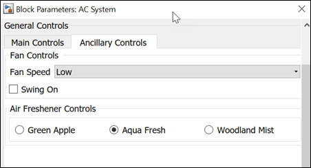
The General Controls section contains tabs to segregate and categorize information under Main Controls and Ancillary Controls. The Main Controls tab uses Dials and Slider to accept inputs for air conditioner parameters. You can edit the property of dial and slider in the property editor section of Mask Editor to place them horizontally or vertically.

The Ancillary Controls use Popup, Check Box, and Radio Buttons.

The Advanced Controls section is a collapsible panel that contains spinbox, minimum, and maximum parameters to accept inputs.
