Graphical Icon Editor Overview
You can use the Graphical Icon Editor to create and edit masked block icons in a graphical environment. You can create block icons that change when you make changes to the underlying block, such as changing parameter values or resizing the block.
You can launch the Graphical Icon Editor from the Mask Editor by selecting the Icon tab. Using the Graphical Icon Editor, you can:
Create icons visually using drawing tools, preset shapes, text, images, and alignment aids, such as grids, snap‑to‑grid, smart guides, and rulers.
Use the Parts feature to render multiple variations of the same block. For more information, see Render Multiple Variations of Same Block Icon Using Parts.
Show or hide specific elements in the icon based on conditions derived from block parameters or mask parameters. For more information, see Show or Hide Elements in the Icon Based on Block Parameters.
Position each element on the icon relative to other elements or canvas. For more information, see Position Elements Relatively Using Relative Positioning.
Preview the icon in various scenarios such as horizontally stretching, flipping, or scaling.
Graphical Icon Editor Interface
To create and edit icons of masked blocks in a graphical environment, open the Graphical Icon Editor from the Mask Editor by selecting the Icon tab. The options available in these tabs are context-sensitive.
Toolstrip
Use the options in the toolstrip to set various properties of icon and icon elements. This table shows various sections available in the Toolstrip.
| Section | Property | Functionality |
|---|---|---|
| Save | Save Mask | Save the mask. |
| Authoring Mode | Graphical | Switch between the drawing command mode and graphical editor. |
| Icon File | File Name | Displays name of the file. |
| Save with Model | If turned ON, icon file will be saved with model else it will be saved as an external file on disk. | |
| Save As | Rename and save masked block icon. | |
| Import | Import Icon Part — Import single or multiple parts into
the icon. | |
Import Icon — Import a new icon. | ||
| Delete Icon | Remove the icon from the block. If the icon is saved with the model, the icon file will be removed. | |
| Drawing Aids | Grid | Enable these options to create precisely positioned elements. These options help you to visualize the number of pixels each element occupies in the icon. |
| Snap to Grid | Snaps the element to the nearest grid line. | |
| Port Grid | Display port grids to align elements with respect to the ports. | |
| Grid Size | Control the spacing between the grid lines. | |
| Grid Color | Select a color for the grid. | |
| Smart Guides | Use smart guides and rulers to align or position an element with respect to other elements in the icon or the canvas. | |
| Rulers | Use rulers for precise positioning of an element. | |
| Parts | Add | Add a new part to the icon. |
| Duplicate | Duplicate an existing part. | |
| Delete | Delete an existing part. | |
| View All | View all icon parts in a block icon. | |
| Configuration | Ports | Define the number of ports on the left, right, top, and bottom of the icon. These are only visual guides and do not add real ports to the actual block. |
| Conditions | View All Conditions | Display all the visibility conditions available on a block icon. You can also edit these conditions. |
| Preview | Preview in Model | Visualize the icon with:
|
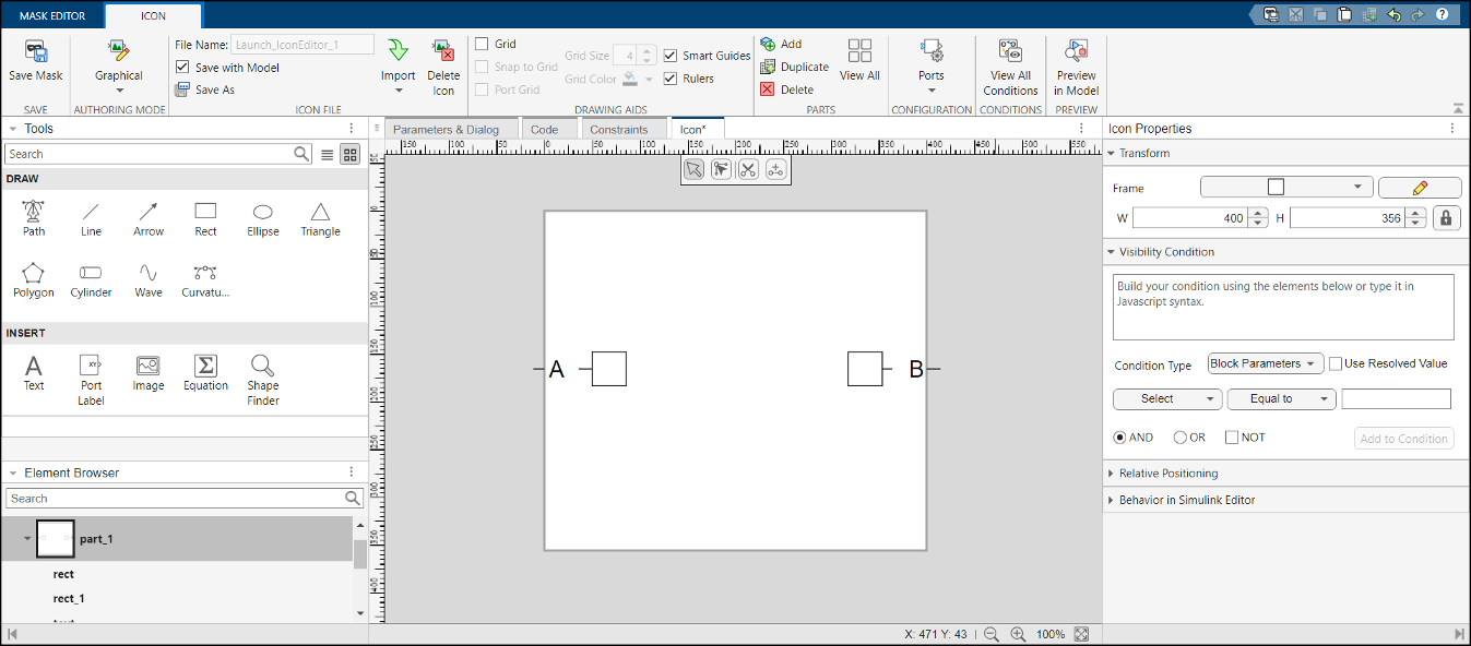
Icon Properties
Icon Properties pane appears on the right side of the Icon Editor and enables you to view and edit specific attributes of element, such as visibility conditions and relative positioning. This table shows various sections available in Icon Properties.
| Section | Property | Functionality |
| Transform | H and W | Set the height and width of the canvas. Remove the lock to change the height and width of the canvas without preserving the aspect ratio between height and width. |
| Frame | Set the frame shape to any of the available shapes, such as
Rectangle, Circle,
Ellipse, Triangle,
Trapezium, or Pentagon. You can also
customize the frame of the block. Select a shape and click the
pencil icon button to modify the block frame. | |
None — The default shape is retained and does not show a
frame for the block. | ||
| Visibility Condition | Set a visibility condition for the icon. Visibility conditions support JavaScript expressions only. | |
| Path Points | X and Y | Select an edit point in a shape and then modify the X and Y coordinates of the edit point. |
| Point Type | Change between smooth point and corner point. | |
| Symmetric Handles | Symmetrically move the handles of the edit point. | |
| Behavior in Simulink Editor | Rotate | Set this option to rotate the icon along with the block. |
| Resize | Off — Icon retains its original size when the block
resizes. | |
On — Icon resizes to fit the block. | ||
Shrink Only — Icon resizes to fit to the block while
shrinking but not otherwise. | ||
| Resize Limit | Set the maximum limit to which the element is resizable. | |
| Foreground | Allow — Change foreground color of the icon. You can
change the foreground color by right-clicking the Simulink® canvas and using the context menu. | |
Disallow — Retain the original color of the canvas on the
icon even when the canvas color changes. | ||
Inherit from Ports — Use the color of the port associated
with this element as the foreground color. | ||
| Background | Allow — Change background color of the icon. You can
change the background color by right-clicking the Simulink canvas and using the context menu. | |
Disallow — Retain the original color of the canvas on the
icon even when the canvas color changes. | ||
Transparent — Use a transparent background for the block.
This option is selected by default for Simscape™ blocks. | ||
| Normalize Width | On — Select this option to set the stroke width of all the
elements to one pixel. | |
| Scale With Ports | On — Select this option to scale the stroke width of the
element by the style of the line that is connected to the port that is associated
with this element. | |
| Scale on Zoom | On — Select this option to increase the stroke width when
the canvas is zoomed in and decrease the stroke width when the canvas is zoomed
out. | |
| Scale on Resize | On — Scale stroke linearly on resizing the block. | |
Off — Maintain constant stroke width on resizing the
block. | ||
Shrink Only — Scale stroke linearly when the block shrinks
and do not scale when icon is enlarged. |
Element Properties
Element Properties pane appears on the right side of the Icon Editor on selecting an element. It enables you to modify the visual characteristics of a selected element, such as its format and behavior in Simulink Editor. This table shows various sections available in Element Properties.
| Section | Property | Functionality |
|---|---|---|
| Transform | X, Y | Set the X and Y coordinates of the element. |
| W, H | Set the width and height of the element. Remove the lock to change the width and height of the element without preserving the aspect ratio. | |
Angle | Specify an angle in degrees to rotate the element to the specified angle. | |
Flip horizontally | Flip the element horizontally. | |
Flip vertically | Flip the element vertically. | |
Corner radius | Adjust the radius of the corners of an element. | |
| Format | Fill | Select a color to fill the element and enter a value between 0 and 1 to adjust the transparency of the color. |
| Stroke | Select a stroke color and enter a value between 0 and 1 to adjust transparency of the stroke color. | |
| Stroke style | Enter the stroke width and select the stroke style. | |
| Cap type | Select the style for the end of the line or path. | |
| Join type | Select the style for the joints for the path element. | |
| Start type | Select the start arrow head type. Toggle to fill the arrow head and then select the size of the arrow head. | |
| End type | Select the end arrow head type. Toggle to fill the arrow head and then select the size of the arrow head. | |
| Font Size | Select the size of the text from the available options. | |
| Scale on Resize | On — Scale stroke linearly on resizing the block. | |
Off — Maintain constant stroke width on resizing the
block. | ||
| Style | Make text element bold, italic, underline, or strike through on the icon. | |
| Visibility Condition | Set a visibility condition for the element. Visibility conditions support JavaScript® expressions only. You can create a visibility condition using the Condition Builder option. | |
| Parameter Association | Parameter or Expression | Select the parameter that appears in place of the text on the canvas or evaluate an expression using JavaScript. |
| Evaluate parameter | Evaluate the parameter displayed on the block. | |
| Allow editing on the block | Option to edit the value of the parameter on the block icon. | |
| Trim text | If the text exceeds the boundaries of the block, it is truncated and an ellipsis (...) appears at the end to indicate the overflow. | |
| Pin at canvas centre | The text element remains centered on the canvas at all times, regardless of the block size or the content of the text. | |
| Relative Positioning | Source | Select the specific shape or anchor point that you want to move or position. |
| Relative to | Choose the reference object or block boundary that determines the source's position. | |
| Offset | Specify the exact horizontal and vertical distance to maintain between the source and the reference point. | |
| Dynamic Port Elements | Ports | Repeat elements on right or left ports. |
| Generation Algorithm | Increment — Increment the text element. For example, if
the text element is w and you select
Increment as the Generation Algorithm, the text element
increments to w1, w2, and so on. | |
Duplicate — Duplicate an icon element. | ||
Parameter Value — Display the parameter value at the
ports. | ||
| Parameter Name | Select the parameter whose value will be displayed at the ports. This option is applicable only to text elements. | |
| Behavior in Simulink Editor | Rotate | With Parent — Rotate the element with its parent. |
Readable — Maintain a readable text element. The text
appears from left to right or bottom to top without mirroring. | ||
Fixed — Maintain the orientation of the element even if
the block is rotated. | ||
With Ports — Rotate the element along with the
port. | ||
| Resize | On — Scale linearly along with parent when the icon is
resized. | |
Off — Maintain the size of the element when the icon is
resized. | ||
Shrink Only — Shrink the element linearly when its parent
shrinks but maintains the size when its parent is enlarged. | ||
Adaptive — Scale port labels appropriately along with the
block. | ||
| Resize Limit | Set the maximum limit to which the element is resizable. | |
| Horizontal Scaling | On — Scale the element horizontally along with the
block. | |
Off — Maintain the width of the element. | ||
Shrink Only — Shrink the elements horizontally when its
parent shrinks but maintain the size when its parent is enlarged. | ||
| Vertical Scaling | On — Scale the element vertically along with the
block. | |
Off — Maintain the height of the element. | ||
Shrink Only — Shrink the elements vertically when its
parent shrinks but maintain the size when its parent is enlarged. | ||
| Scale On Zoom | On — Scale the element linearly when the canvas is
zoomed. | |
Off — Maintain the size of the element when the canvas is
zoomed. | ||
Shrink Only — Shrink the element when the canvas is zoomed
out and maintain its size when the canvas is zoomed in. | ||
| Normalize Width | Inherit — Inherit the style from the icon. If the element
is part of a group, then it inherits the style from its parent element. | |
On — Set the stroke width of all the elements to one
pixel. | ||
| Scale With Ports | Inherit — Inherit the style from the icon. If the element
is part of a group, then it inherits the style from its parent element. | |
On — Scale the stroke width of the element by the style of
the line that is connected to the port that is associated with this
element. | ||
| Scale On Zoom | Inherit — Inherit the style from the icon. If the element
is part of a group, then it inherits the style from its parent element. | |
On — Scale the stroke width of the elements when the
canvas is zoomed out. Maintain a constant stroke width when the canvas is zoomed
in. | ||
| Scale On Resize | Inherit — Inherit the style from the icon. If the element
is part of a group then it inherits the style from its parent element. | |
On — Scale the stroke of the element linearly on resizing
icon. | ||
Off — Maintain constant stroke width of the elements on
resizing icon. | ||
Shrink Only — Scale stroke of the elements linearly when
the icon shrinks and do not scale when the icon is enlarged. |
Drawing Tools
Drawing Tools pane appears on the left side of the Icon Editor and this collection of tools allows you to create custom icons using basic shapes, paths, and equations. This table shows various tools available.
| Tool | Functionality |
|---|---|
| Draw | |
| Path | Draw any desired custom shape. Click to add anchor points for straight lines, or click and drag to form smooth curves. |
| Line | Draw lines. |
| Arrow | Draw an arrow. |
| Rect | Draw a rectangle or square. |
| Ellipse | Draw an ellipse or circle. |
| Triangle | Draw a triangle. |
| Polygon | Draw a polygon. Specify the number of vertices to create a polygon with the desired number of sides. |
| Cylinder | Draw a cylinder. |
| Wave | Draw a wave. |
| Curvature | Simplify path creation. To draw curves, click the canvas in two separate locations to create anchor points. Drag the center point to draw the curve. Drag the edge points of the curve to enlarge it. You can also rotate the curve clockwise or anticlockwise to form loops. |
| Insert | |
| Text | Insert a text element. |
| Port Label | Specify the port label that will appear on the assigned port. |
| Image | Insert an image into the icon by browsing for an image file and placing it on the canvas. |
| Equation | Write equations using LaTeX markup. This tool is similar to the equation tool in MATLAB® and Simulink. |
| Shape Finder | Search for and insert shapes in a way similar to the quick insert feature on the Simulink canvas. Double-click on the canvas and type the name of the shape that you want to insert. |
| Edit Shape | Edit all supported shapes, such as rectangles, ellipses, lines, and paths. To edit a shape, select the Edit Shape tool in fixed palette above the canvas and click an element. All edit points that form the shape appear. |
| Scissor | Split a path or element on the canvas at an anchor point or along a segment. Click a point on the path you want to split. To modify the object, select the anchor points that are created due to splitting. |
| Connector | Connect two or more open paths. This connection creates a single path element. Click the tool and drag to connect open paths. |
Note
Along with these tools to draw shapes, you can use the Shape Finder tool to browse and use predefined shapes from the Electrical, Translational, and Rotational libraries. You can also use basic shapes like Cylinder, Triangle, Axis, and Wave.
Element Browser
Element Browser pane appears on the left side of the Icon Editor. Use the Element Browser to:
Identify each element using a unique name.
Hide or unhide an element so that it does not get in the way while modifying other elements.
Lock or unlock an element so that the position of the element is locked in the icon.
Arrange elements within the group.
Delete elements.
Maintain a stack order for the elements.