Main Content

qqplot

Quantile-quantile plot

Description

example

qqplot(x) displays a quantile-quantile plot of the quantiles of the sample data x versus the theoretical quantile values from a normal distribution. If the distribution of x is normal, then the data plot appears linear.

qqplot plots each data point in x using plus sign ('+') markers and draws two reference lines that represent the theoretical distribution. A solid reference line connects the first and third quartiles of the data, and a dashed reference line extends the solid line to the ends of the data.

example

qqplot(x,pd) displays a quantile-quantile plot of the quantiles of the sample data x versus the theoretical quantiles of the distribution specified by the probability distribution object pd. If the distribution of x is the same as the distribution specified by pd, then the plot appears linear.

example

qqplot(x,y) displays a quantile-quantile plot of the quantiles of the sample data x versus the quantiles of the sample data y. If the samples come from the same distribution, then the plot appears linear.

qqplot(___,pvec) displays a quantile-quantile plot with the quantiles specified in the vector pvec. Specify pvec after any of the input argument combinations in the previous syntaxes.

example

qqplot(ax,___) uses the plot axes specified by the Axes object ax. The option ax can precede any of the input argument combinations in the previous syntaxes.

h = qqplot(___) returns the handles (h) to the lines in the quantile-quantile plot.

Examples

collapse all

Use a quantile-quantile plot to determine whether gas prices in Massachusetts follow a normal distribution.

Load the sample data.

load gas

The sample data in price1 and price2 represent gasoline prices at 20 different gas stations in Massachusetts. The samples were collected during two different months.

Create a quantile-quantile plot to determine if the gas prices in price1 follow a normal distribution.

figure
qqplot(price1)

Figure contains an axes object. The axes object with title QQ Plot of Sample Data versus Standard Normal, xlabel Standard Normal Quantiles, ylabel Quantiles of Input Sample contains 3 objects of type line. One or more of the lines displays its values using only markers

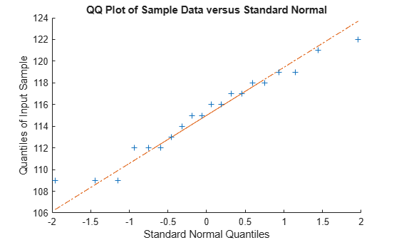
The plot produces an approximately straight line, suggesting that the gas prices follow a normal distribution.

Use a quantile-quantile plot to determine whether two sets of sample data come from the same distribution.

Load the sample data.

load gas

The sample data in price1 and price2 represent gasoline prices at 20 different gas stations in Massachusetts. The samples were collected during two different months.

Create a quantile-quantile plot using both sets of sample data, to assess whether prices at different times have the same distribution.

qqplot(price1,price2);

Figure contains an axes object. The axes object with xlabel X Quantiles, ylabel Y Quantiles contains 3 objects of type line. One or more of the lines displays its values using only markers

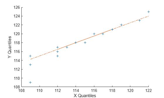
The plot produces an approximately straight line, suggesting that the two sets of sample data have the same distribution.

Use a quantile-quantile plot to determine whether sample data comes from a Weibull distribution.

Load the sample data.

load lightbulb

The first column of the data has the lifetime (in hours) of two types of light bulbs. The second column has information about the type of light bulb. 1 indicates fluorescent bulbs whereas 0 indicates the incandescent bulbs. The third column has censoring information. 1 indicates censored data, and 0 indicates the exact failure time. This is simulated data.

Remove the censored data.

lightbulb = [lightbulb(lightbulb(:,3)==0,1),...
    lightbulb(lightbulb(:,3)==0,2)];

Create a variable for each light bulb type. Include only uncensored data.

fluo = [lightbulb(lightbulb(:,2)==0,1)];
insc = [lightbulb(lightbulb(:,2)==1,1)];

Create a Weibull probability distribution object using the default parameters of A = 1 and B = 1.

pd = makedist('Weibull');

Create a q-q plot to determine whether the lifetime of fluorescent bulbs has a Weibull distribution.

figure
qqplot(fluo,pd)

Figure contains an axes object. The axes object with title QQ Plot of Sample Data versus Distribution, xlabel Quantiles of weibull Distribution, ylabel Quantiles of Input Sample contains 3 objects of type line. One or more of the lines displays its values using only markers

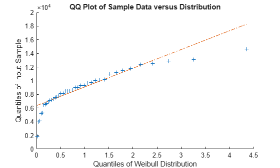
The plot is not a straight line, suggesting that the lifetime data for fluorescent bulbs does not follow a Weibull distribution.

Display a side-by-side pair of quantile-quantile plots using the tiledlayout and nexttile functions.

Load the patients data set. Separate the patient diastolic blood pressure levels into two data sets: one containing the diastolic blood pressure levels of smokers and one containing the diastolic levels of nonsmokers.

load patients

smokerIndices = (Smoker == 1);
nonsmokerIndices = (Smoker == 0);

smokerDiastolic = Diastolic(smokerIndices);
nonsmokerDiastolic = Diastolic(nonsmokerIndices);

Create a 2-by-1 tiled chart layout using the tiledlayout function. Create the first set of axes ax1 within the chart layout by calling the nexttile function. In the axes, display a q-q plot to determine whether the diastolic blood pressure levels of smokers come from a normal distribution. Create the second set of axes ax2 within the tiled chart layout by calling the nexttile function. In the axes, display a q-q plot to determine whether the diastolic blood pressure levels of nonsmokers come from a normal distribution.

tiledlayout(2,1)

% Top axes
ax1 = nexttile;
qqplot(ax1,smokerDiastolic)
ylabel(ax1,'Diastolic Quantiles for Smokers')
title(ax1,'QQ Plot of Smoker Diastolic Levels vs. Standard Normal')

% Bottom axes
ax2 = nexttile;
qqplot(ax2,nonsmokerDiastolic)
ylabel(ax2,'Diastolic Quantiles for Nonsmokers')
title(ax2,'QQ Plot of Nonsmoker Diastolic Levels vs. Standard Normal')

Figure contains 2 axes objects. Axes object 1 with title QQ Plot of Smoker Diastolic Levels vs. Standard Normal, xlabel Standard Normal Quantiles, ylabel Diastolic Quantiles for Smokers contains 3 objects of type line. One or more of the lines displays its values using only markers Axes object 2 with title QQ Plot of Nonsmoker Diastolic Levels vs. Standard Normal, xlabel Standard Normal Quantiles, ylabel Diastolic Quantiles for Nonsmokers contains 3 objects of type line. One or more of the lines displays its values using only markers

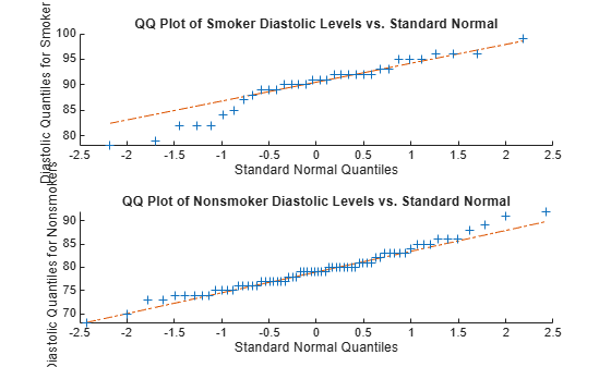
The second plot more closely follows a straight line, suggesting that the sample of nonsmoker blood pressure values has an approximately normal distribution. In contrast, the first plot has points below the line to the left, suggesting a heavier tail (more outliers) than a normal distribution.

Input Arguments

collapse all

Sample data, specified as a numeric vector or numeric matrix. If x is a matrix, then qqplot displays a separate line for each column.

qqplot displays the sample data using the plot symbol '+'. A line joining the first and third quartiles of each distribution is superimposed on the plot. The line represents a robust linear fit of the order statistics for the data in x. This line is extrapolated out to the minimum and maximum values in x to help evaluate the linearity of the data.

Data Types: single | double

Second set of sample data, specified as a numeric vector or numeric matrix. x and y do not need to be the same length. However, if x and y are matrices, they must contain the same number of columns. If x and y are matrices, then qqplot displays a separate line for each pair of columns.

qqplot selects the quantiles to plot based on the size of the smaller data set.

Data Types: single | double

Hypothesized probability distribution, specified as a probability distribution object. qqplot plots the quantiles of the input data x versus the theoretical quartiles of the distribution specified by pd.

Create a probability distribution object with specified parameter values using makedist, or fit a probability distribution object to data using fitdist.

Quantiles for plot, specified as a numeric value, or vector of numeric values, in the range [0,100].

For a single set of sample data (x), qqplot uses the quantiles in x. For two sets of sample data (x and y), qqplot uses the quantiles in the smaller of the two data sets.

Data Types: single | double

Axes for the plot, specified as an Axes object. If you do not specify ax, then qqplot creates the plot using the current axes. For more information on creating an Axes object, see axes.

Output Arguments

collapse all

Graphics handles for line objects, returned as a vector of Line graphics handles. Graphics handles are unique identifiers that you can use to query and modify the properties of a specific line on the plot. For each column of x, qqplot returns three handles:

  • The line representing the data points. qqplot represents each data point in x using plus sign ('+') markers.

  • The line joining the first and third quartiles of each column of x, represented as a solid line.

  • The extrapolation of the quartile line, extended to the minimum and maximum values of x, represented as a dashed line.

To view and set properties of line objects, use dot notation. For information on using dot notation, see Access Property Values. For information on the Line properties that you can set, see Line Properties.

More About

collapse all

Quantile-Quantile Plot

A quantile-quantile plot (also called a q-q plot) visually assesses whether sample data comes from a specified distribution. Alternatively, a q-q plot assesses whether two sets of sample data come from the same distribution.

A q-q plot orders the sample data values from smallest to largest, then plots these values against the expected value for the specified distribution at each quantile in the sample data. The quantile values of the input sample appear along the y-axis, and the theoretical values of the specified distribution at the same quantiles appear along the x-axis. If the resulting plot is linear, then the sample data likely comes from the specified distribution.

The q-q plot selects quantiles based on the number of values in the sample data. If the sample data contains n values, then the plot uses n quantiles. Plot the ith ordered value (also called the ith order statistic) against the i0.5nth quantile of the specified distribution.

A q-q plot can also assess whether two sets of sample data have the same distribution, even if you do not know the underlying distribution. The quantile values for the first data set appear on the x-axis and the corresponding quantile values for the second data set appear on the y-axis. Since q-q plots rely on quantiles, the number of data points in the two samples does not need to be equal. If the sample sizes are unequal, the q-q plot chooses the quantiles based on the smaller data set. If the resulting plot is linear, then the two sets of sample data likely come from the same distribution.

Version History

Introduced before R2006a